We partnered with VI Markets—an established, expansive, and highly visible trading platform operating across the region. When a company of this size updates its identity, the stakes are structural. There’s no room for noise, no space for invention without reason. This was not about leading campaigns. It was about establishing a structural system that could support everything the company had already built.
Before design began, we conducted extensive market research, mapping regional behaviors, competitor positioning, and sector-specific tensions. For a client of this scale, a misstep in identity is more than aesthetic—it can destabilize perception. Our task was to ensure precision.
This rebrand was defined by alignment. Not by reinvention, but by refinement. We didn’t reshape who VI Markets is—we gave form to what it had already become.
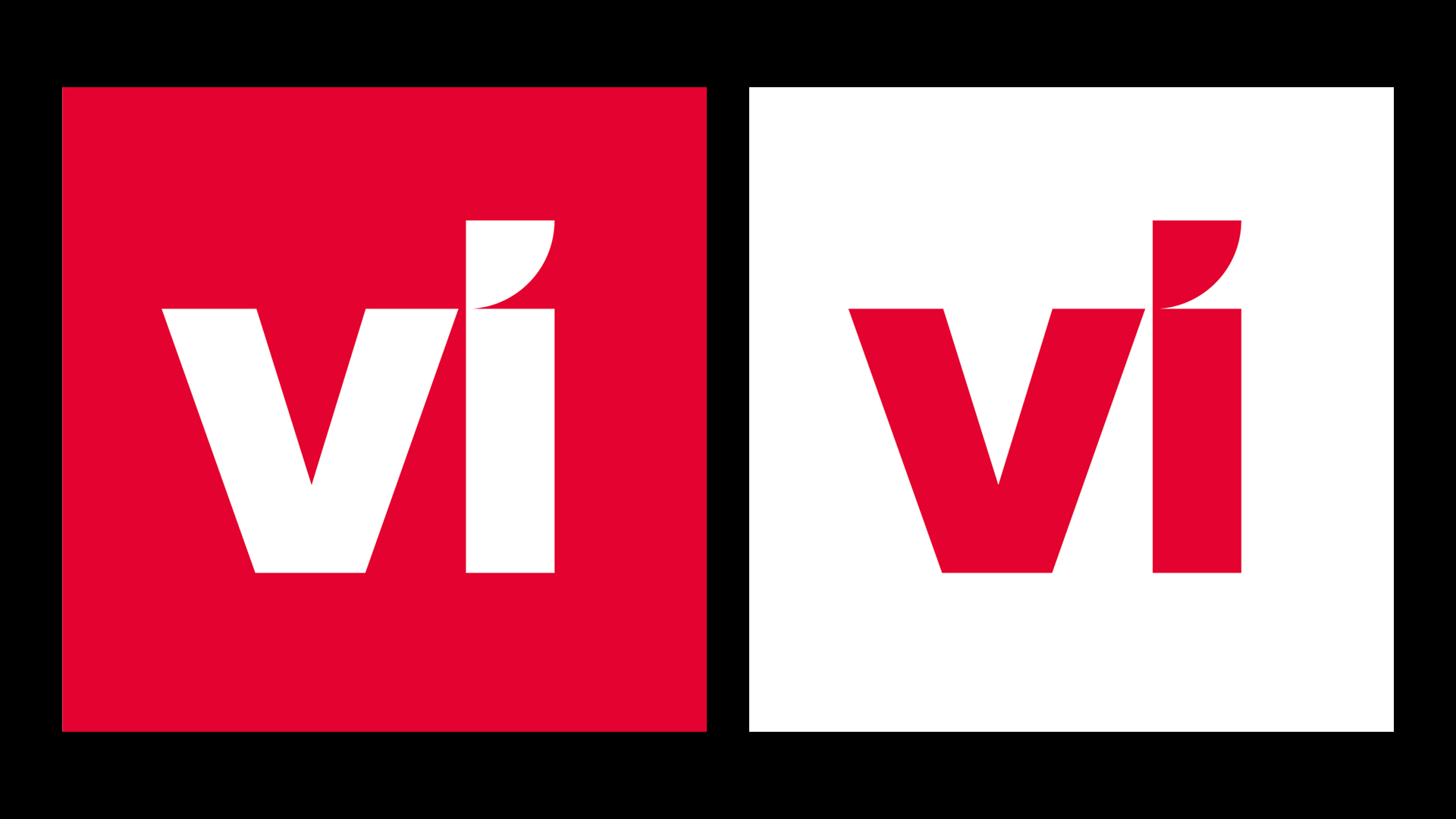
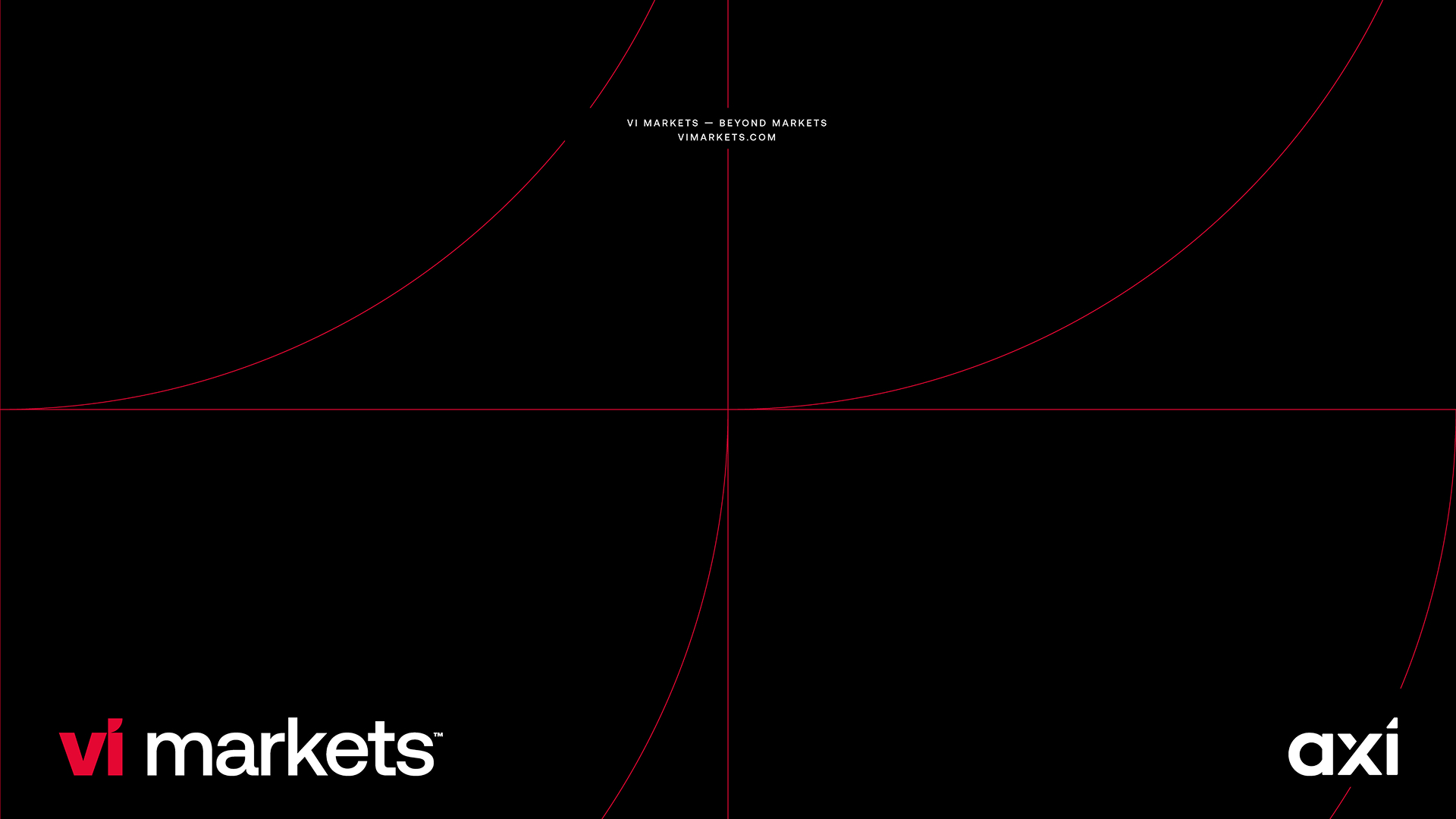
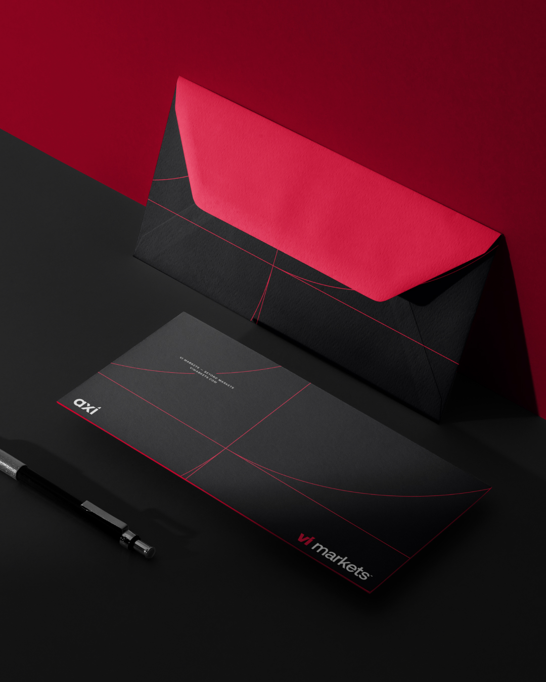
The mark is deliberate. “vi” serves as both a typographic construct and symbolic anchor. The angled form of the “i” informed the broader system: a visual grid of tension and control, applied across physical and digital contexts.
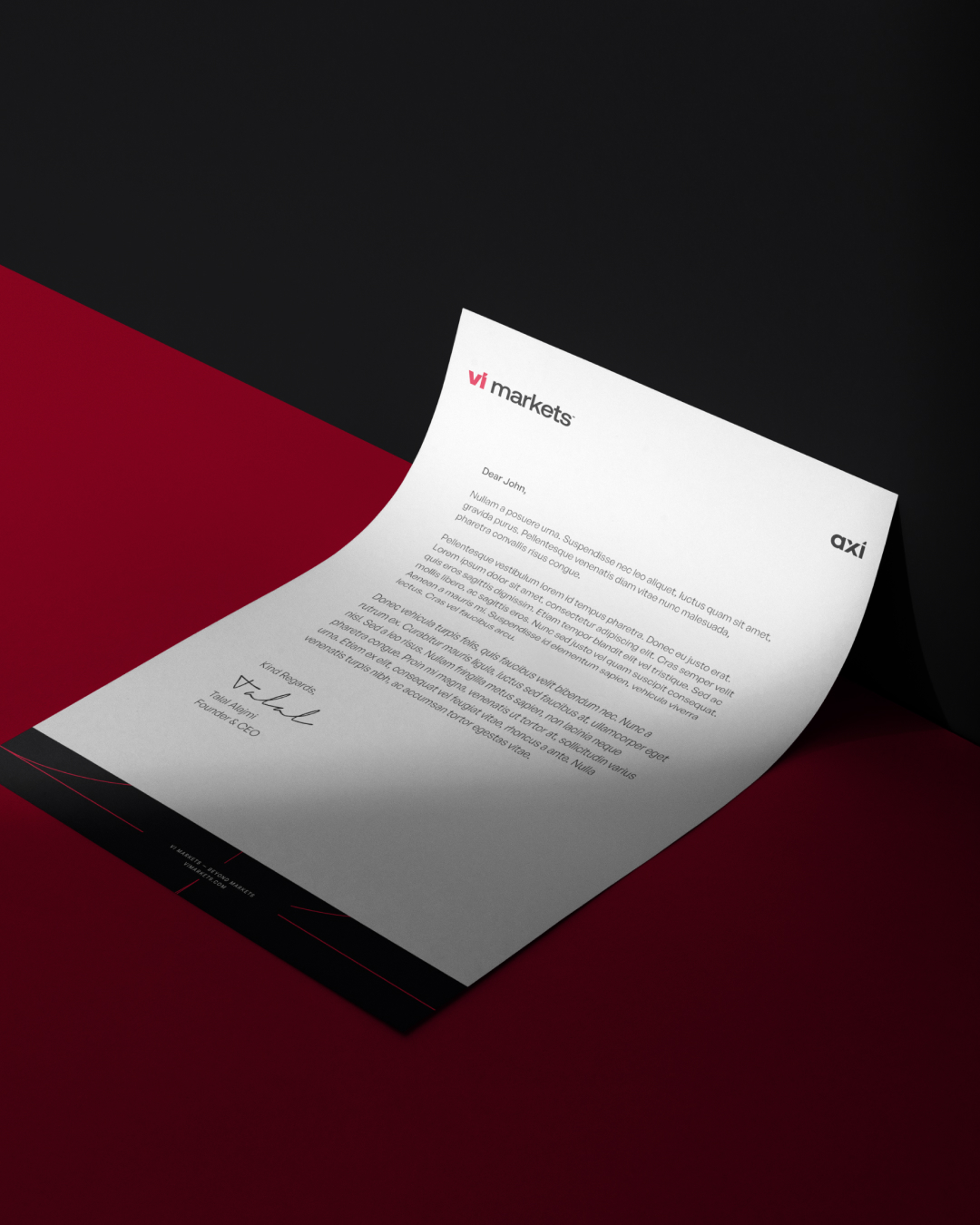
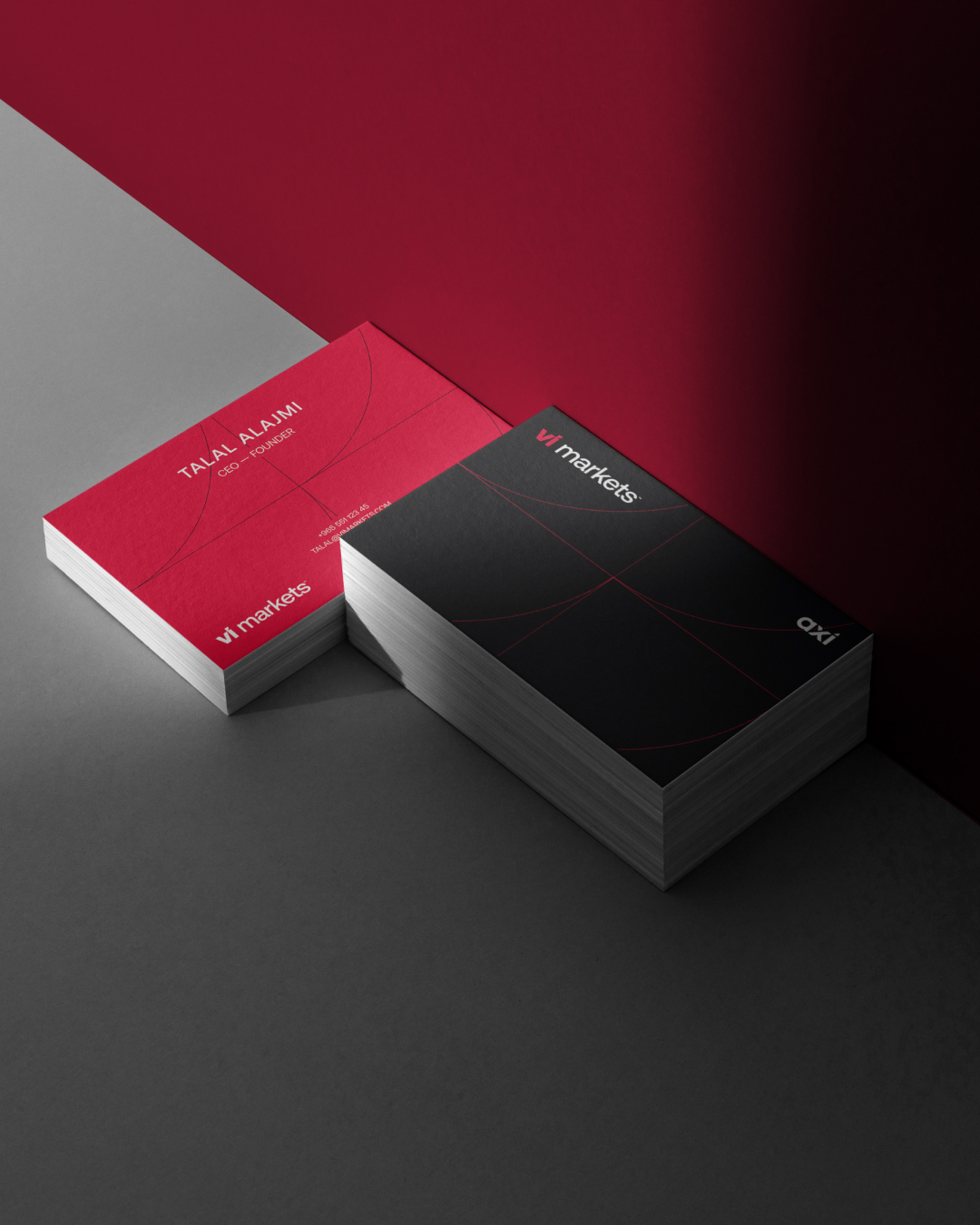
The visual language is architectural—sharp, weight-bearing, and measured. Red and black are not used for energy, but for certainty. Every line, curve, and proportion is placed with structural intent.
Typography is neutral yet confident. The verbal tone is informed, composed, and stripped of noise. It does not market. It states.
The result is a brand engineered for scale and clarity. One built not to attract attention, but to hold ground.